Executive summary
An AI product page earns interest through its demo and messaging, then asks the visitor to commit at the pricing section. That section is where most trials are lost. Across business software, the median free trial converts to a paid plan at 18.5 percent, and the average pricing page turns only 3 to 5 percent of its visitors into a signup or demo request. The pricing section is also the highest-leverage surface on the site, since a 1 percent improvement in price can raise operating profit by roughly 11 percent, yet it is usually the least optimized part of the page.
This report identifies five recurring sources of friction in AI pricing sections, each supported by conversion data: a price shown before its value, unpredictable usage-based billing, costs hidden in the fine print, plans locked behind a sales call, and too many tiers. It quantifies each source, then sets out prioritized fixes. The figures below frame the analysis.
Key figures
| Metric | Figure | Source |
|---|---|---|
| Median B2B free trial to paid conversion | 18.5% | First Page Sage |
| Average pricing page, visitor to signup | 3 to 5% | Unbounce |
| Operating profit gain from a 1% price increase | ~11% | McKinsey |
| Buyers who reject vendors that hide pricing | 62% | TrustRadius |
| Companies that exceeded cloud budgets last year | 72% | FinOps Foundation |
| Checkout abandonment from unexpected costs | 48% | Baymard Institute |
Pricing leverage on revenue
Pricing deserves disproportionate attention because it is the most efficient lever a software business has. In a study of 512 SaaS companies, a 1 percent improvement in monetization raised the bottom line by 12.7 percent, compared with 6.7 percent for the same gain in retention and 3.3 percent for acquisition. Monetization, which the pricing section controls directly, is therefore about four times as powerful as winning more traffic.
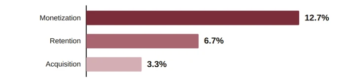
Figure 1. Impact on the bottom line from a 1 percent improvement in each growth lever, across 512 SaaS companies. Source, Price Intelligently and ProfitWell.
The pattern holds at the level of the model. Companies using more sophisticated, value-aligned pricing report about 30 percent higher net revenue retention and 25 percent faster growth than those on simpler models. A well-built pricing section is not a formality at the end of the page. It is a growth mechanism, and small improvements compound over every cohort that follows.
Trial-to-paid conversion benchmarks
Conversion at the pricing section varies widely by model and segment. The median business software free trial converts to paid at 18.5 percent, with strong performers reaching 30 to 45 percent. Freemium products convert far lower, near 2.6 percent for organic free-to-paid. At the top of the funnel, the pricing page itself converts 3 to 5 percent of visitors to a signup or demo on average, and 7 to 10 percent for the best performers. The main reference points appear below.
| Model or segment | Conversion | Source |
|---|---|---|
| Median B2B free trial to paid | 18.5% | First Page Sage |
| Free trial, credit card required | ~31% | ChartMogul |
| Free trial, no credit card | ~9% | ChartMogul |
| Freemium, free to paid | ~2.6% | First Page Sage |
| Pricing page visitor to signup, average | 3 to 5% | Unbounce |
| Pricing page visitor to signup, top performers | 7 to 10% | Unbounce |
Table 1. Conversion reference points. Figures are directional and vary by price point, audience, and motion.
These numbers are a starting frame, not a target. A product should measure its own rates at each step, since the gap between a pricing section that converts at 4 percent and one that converts at 1.5 percent is rarely the price itself. It is how much work the page asks of the visitor.
Price transparency and hidden pricing
Whether a price appears at all is one of the largest single factors in pricing-page performance. In a study of 31 million visitors across 80 business software companies, 37.5 percent of pricing pages did not show a price. Those pages converted 1.7 times fewer visitors into qualified pipeline, even though they collected more raw form fills. Buyers react poorly to a missing number. 62 percent say they reject a vendor that will not show pricing before a sales conversation, and 72 percent expect to see pricing during evaluation. Two in three now prefer to complete a purchase with no sales representative at all.
| Practice | Measured effect | Source |
|---|---|---|
| Hiding all pricing behind a sales call | 1.7× fewer visitors converted to pipeline | HockeyStack |
| Publishing a starting-price floor | ~22% higher conversion than no anchor | OpenView |
| Contact-for-pricing pages | ~38% higher bounce rate | ChartMogul |
| Buyers who expect a visible price | 72% | Gartner |
Table 2. Effect of pricing visibility on conversion and bounce.
Concealing a price is justified only for genuinely complex, high-value deals, and even then a starting floor outperforms a blank page. For every plan a self-serve buyer might choose, a visible number or a tight range removes the largest avoidable source of drop-off, and it pre-qualifies the buyers who do reach out.
Usage-based pricing and bill predictability
AI products almost always bill by consumption, on tokens, credits, or compute. Usage-based pricing is now mainstream in software. Most companies use some form of it, hybrid seat-plus-usage is the most common model, and 44 percent of SaaS now charge specifically for AI features. Consumption billing also correlates with growth, since usage and hybrid models grew about 27 percent in early 2024 while flat subscriptions slowed to 12 percent. The difficulty is predictability. To a buyer, a meter that only moves upward is a source of anxiety, and the concern is well founded. In the past year, 72 percent of companies exceeded their cloud budgets, overshooting by about 17 percent on average, and 44 percent still report limited visibility into what they spend.
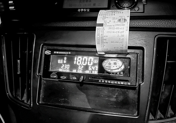
Figure 2. A taxi meter climbing while it prints the bill. Token and compute pricing can feel the same to a buyer. Image, N509FZ via Wikimedia Commons, CC BY-SA 4.0.
The remedy is to make the total knowable before commitment. A live estimator that turns a buyer's own numbers into a monthly figure, a worked example bill, and hard spending caps with alerts at 50, 75, and 90 percent convert consumption pricing from an open-ended risk into a bounded one. Buyers do not object to paying for usage. They object to being surprised by it, which is a design problem, not a pricing one.
Tier count and choice architecture
The number of options on a pricing page has a measurable effect on whether anyone chooses at all. In the most cited study of choice, shoppers shown 24 options bought roughly ten times less often than those shown six. On pricing pages, five or more tiers lowers conversion by about 18 percent, and a page with no visually marked recommended plan converts around 22 percent worse than one that guides the eye to a default. Reducing options can raise revenue directly. In one documented case, cutting a package from 27 features to eight and raising the price produced a 25 percent sales lift, because the smaller set matched what buyers actually valued.
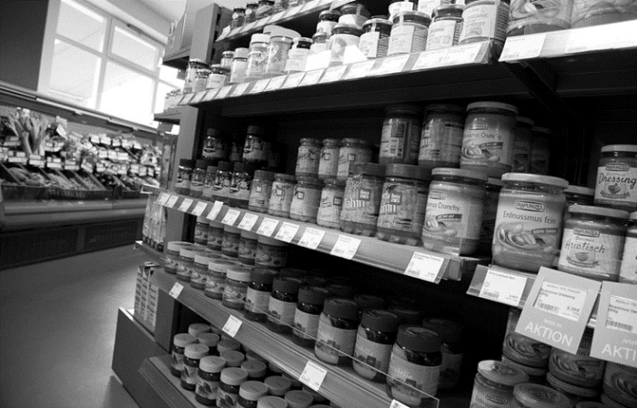
Figure 3. A shelf packed with near-identical options. More choice looks generous and sells less. Image, Tony Webster via Wikimedia Commons, CC BY-SA 4.0.
| Design choice | Effect on conversion | Source |
|---|---|---|
| Twenty-four options versus six | ~10× fewer purchases | Iyengar and Lepper |
| Five or more pricing tiers | ~18% lower conversion | Pricing UX analysis |
| No marked recommended tier | ~22% lower conversion | 2025 UX study |
| Adding a decoy to anchor the choice | 84% chose the target bundle | Ariely |
Table 3. Effect of the number and framing of options.
Anchoring compounds the effect. Presenting the most expensive plan first, or placing a deliberately weaker option next to the target plan, makes the intended choice look reasonable by comparison. Three or four plans, one clearly recommended, with advanced options revealed on request, is the configuration the evidence supports.
Trial commitment models
How a trial asks for commitment strongly affects who converts. Requiring a credit card up front roughly triples conversion, from about 9 percent for an open trial to about 31 percent for a card-required one. The higher rate carries a cost, since a card on file raises the fear of a silent charge when the trial ends, so the gain only holds when the terms are equally clear. Freemium sits at the other end, converting near 2.6 percent but reaching a far larger top of funnel.
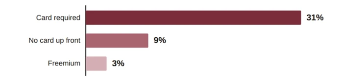
Figure 4. Median conversion by trial model. The shape of the ask moves the result more than the product does. Source, ChartMogul and First Page Sage.
The right model depends on price point and audience, but the mechanics are consistent. State plainly what happens when the trial ends, when the first charge occurs, and how to cancel. Clarity at this point turns the card-required lift into trust rather than suspicion, and it reduces the refunds and chargebacks that follow a surprise.
Mobile pricing experience
Most pricing decisions now begin on a phone. About 58 percent of pricing-page visits occur on mobile, yet many pages still convert better on desktop because their tables and comparison grids break on small screens. Layout details carry measurable weight. Placing a feature comparison table below the pricing cards, where a scrolling buyer is deepest in evaluation, is associated with 15 to 30 percent higher conversion, and positioning social proof near the primary call to action lifts conversion by a further 10 to 20 percent. A pricing section that has not been verified on a phone is losing the majority of its audience at the exact point of decision.
Prioritized recommendations
The following changes address the friction identified above, ordered by expected impact. Each reduces surprise or effort at the pricing section rather than lowering the price.
| Rank | Recommendation | Why it matters |
|---|---|---|
| 1 | Show a real price, or a starting floor, on every self-serve plan | 62% reject vendors that hide pricing, and an anchor lifts conversion about 22% |
| 2 | Make usage totals predictable with an estimator, sample bill, and cap | 72% of companies exceeded cloud budgets last year |
| 3 | Limit to three or four plans and mark one recommended | Five or more tiers lowers conversion about 18%, and a marked pick adds about 22% |
| 4 | Show the full cost, including overages and add-ons, before the trial | 48% of shoppers abandon checkout over unexpected costs |
| 5 | State trial-end terms plainly and verify the mobile layout | Card-required trials convert about 31% versus 9%, and roughly 58% of traffic is mobile |
Table 4. Recommendations in priority order, with the evidence for each.
Together these changes move the pricing section from a list of plans to a decision aid. None depends on discounting. Each is supported by measurable conversion data, and the first two typically return the most for the least effort. A confident price, shown plainly and bounded clearly, converts better than a lower one shown nervously.
Bottom line
Across every section of this report the pattern is the same. Trials are lost less to the size of the price than to how the price is presented. Buyers leave when the number is hidden, when the meter looks unbounded, when the real cost sits in the fine print, when the plan they need is behind a sales call, or when too many options stall the decision. Each of these is a design choice, and each carries a measurable cost in conversion.
The remedy is not a lower price. It is a clearer one. Show a real number or a floor, make usage totals predictable, cut to a few well-marked plans, and say plainly what happens when the trial ends. None of these depends on discounting, and the evidence for each sits in the sections above.
An AI product page does not need to be cheaper to convert. It needs to remove surprise. A confident price, shown plainly and bounded clearly, will outperform a lower price shown nervously, and the pricing section is where that difference is won or lost.